It’s easy to see why most history bloggers love Instagram. It’s highly visual for those luscious shots of stained glass windows and the latest history book’s cover (you know the one you promised you wouldn’t buy yet : ) The history community is welcoming and positive, you make friends and your feed looks curated and amazing.
Well, that is until you upload an Instagram Reels.
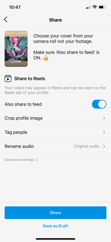
Suddenly, next to your gorgeous picture of Dover Castle is half your head, a weird facial expression you were forced to take from the reel itself or a skew-whiff image. Not so great for your brand.
Enter Stephanie Kase. Not only does she walk you through how to create the right layout for your Instagram Reels cover, but she also sends you a template, for free, which you can use as an overlay. (I am in no way being sponsored to write this – just sharing a fab resource find with you : )
Before you watch the video make sure your emails are open and you are signed in to your Canva account. If you’re not familiar with Canva, it’s free and will change your graphics-creating life forever.
Finally, a laptop or iPad will be easier than trying to do this on your phone.
Is it worth the hassle creating an Instagram Reels cover every time?

Yes, Instagram Reels, used as video content and advertising, is the way forward.
If you’re creating reels but not sharing them to your feed because they show up badly I totally understand. We want our feeds to look pretty, slick and professional. Plus, people rightly or wrongly are judgemental. If they see a strangely cropped photo of you with your eyes closed it looks untidy and they may scroll on by.
But, not sharing your reels is 100% a wasted opportunity to attract new followers, connect and bring people to your history blog. So, let’s fix that.
But, I don’t know how to create an Instagram Reels?
If you are new to Instagram Reels but super curious then Stephanie also has tutorials on how to get started.


